Businesses leave money on the table all the time without realising it, especially in eCommerce.
We worked on a clients eCommerce website and their old website was exactly that, it was old, unresponsive – so looked terrible on mobile devices, it had broken links, outdated products, and even incorrect shipping prices. The entire thing needed to be redesigned and built from the ground up. Their vision for the new site was to have it reflect the style and class of their high-end products. They had lots of thoughts and suggestions on how we do this, and we went through 2 rounds of revisions before the big launch.
The problem
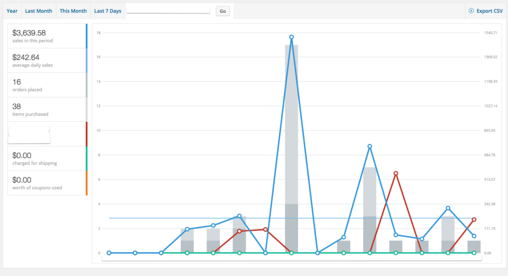 A $3600 2 week period prior to our work
After the launch, they got an all-around positive response. People were loving the new look and were happily making purchases. The client was super happy, and we were proud of our work. It wasn’t until a month’s worth of sales that the client began to be a little disappointed. As you can see above, sales were a little over $1800 a week, and with their new stylized website design, they had hoped for a higher ROI, especially in the first four weeks of revenue. There was only a small increase in sales from their previous year, and that was with their old website!
They weren’t doing any marketing at this point; any marketing at all. Their social media pages had cobwebs, and they hadn’t run an email marketing campaign in as long as they could remember. You see, they had large contracts to supply to even larger retailers such as Nordstrom’s and Bloomingdales, so running an email marketing campaign to customers that had bought directly from them in the past, or creating valuable content to their relatively small audience on social media, was understandably placed at the bottom of their priority list.
However, still concerned, they asked us how we could help. It would be very easy for us as a media agency to simply say it’s down to awareness. I mean, they weren’t doing any marketing so how can they expect sales to increase when nobody knows their new website was even launched? However, we knew we’d also implemented search engine optimisation which had placed them at the top of Google for several keywords, including their own company name (where it wasn’t before); so we checked the analytics. We could immediately see that traffic had in fact increased from the previous year, and that exit pages and time on site statistics were peculiar. We checked the numbers, followed customer journeys, analysed exit pages and created a plan to deliver to the client.
What they were missing
It was a medium-sized list of small hacks. The hacks were to realign the websites function with customer expectations and develop a better UX. You see, we believed that the clients desire to stylize their website to reflect some of how their print material looked was actually causing them to lose revenue. Our list included changing some of the unique names of the nav menu, changing the height of images to encourage users to scroll below the fold, adding arrows for scrollable images on mobile devices, adding product names where there previously weren’t and so on. It was around 4 days of work with testing, and upon review, the site didn’t look quite as stylized as it previously did. It certainly was 10% closer to looking and navigating a little more like a regular eCommerce website, but what did they see in return? Double the revenue.
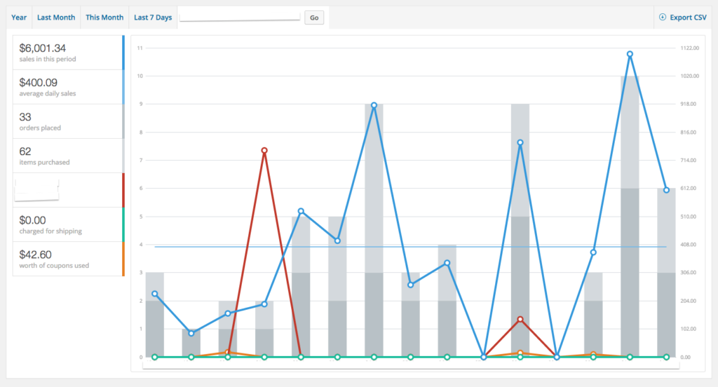 A $6000 2 week period immediately after
Now even though you never truly know the effectiveness of amendments such as these until you test them, we were obviously hoping our changes would show an increase in sales. We hoped that this would reinforce the validity of our professional opinion to the client. But even we didn’t think it would double their revenue. It was literally overnight. We made the changes live in the afternoon and the following day was the beginning of a new line of sales. Exit pages changed, time on site massively increased, and as you can see above, in the following two weeks they nearly doubled revenue, and they doubled it the following fortnight.
When you’re running any eCommerce store, it’s very easy to get into the mindset that customers would purchase if they want to, that the only thing stopping customers making a purchase is a choice to not buy it yet, or buy elsewhere, but that simply isn’t the case. Customers will close out and not finish a transaction because they can’t easily see on a smartphone that they indeed have two of an item in their cart. They’ll navigate away because the title of the product isn’t 100% clear what type of style it’ll be, and changing moments like these on your website will allow more customers to travel through your eCommerce site undeterred, and thus to purchase.
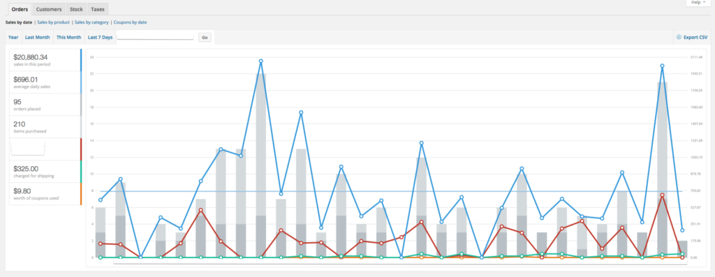 The entire month brought in over $20,000
So get your analytics on the table and start reviewing your eCommerce site page by page. Look at the data and see if you can determine why customers are leaving on those exit pages. That small styling issue on a smartphone that you don’t think people would notice, they do, so have it updated. If you need to make a hire to get those changes made, remember to see it as an investment because a good team will increase your sales, and get you an ROI. Who wouldn’t want to double their sales overnight?
Like this post? Great! Follow us on Twitter @yetiinc.